
PEI Preserve Company
Visual Brand Identity Refresh, Print & Packaging, Illustration
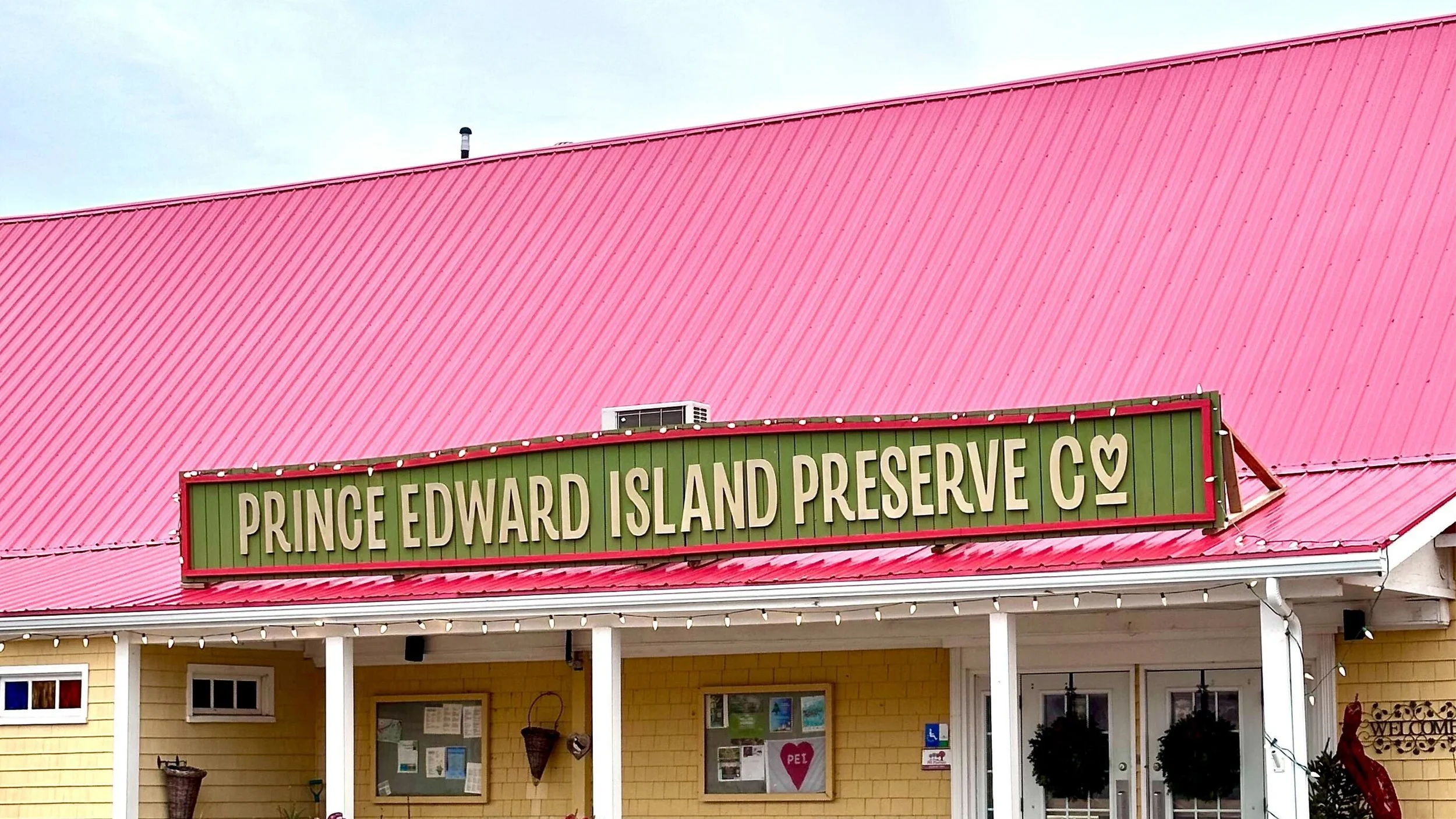
The PEI Preserve Company is a Canadian preserve company based in Prince Edward Island. Established in 1985, the company has grown to become one of the leading producers of high-quality, artisanal preserves in Canada.
The mission of the PEI Preserve Company is to create exceptional preserves using traditional methods and natural ingredients. Their preserves are made in small batches to ensure the highest quality and flavour. The company's vision is to be recognized as a leader in the preserve industry, known for their commitment to quality and sustainability.
The PEI Preserve Company values traditional methods and craftsmanship, using only the best natural ingredients to create their preserves. They are committed to sustainable practices, using locally sourced ingredients and reducing waste wherever possible. The company also supports the local community, contributing to local charities and organizations and promoting Prince Edward Island as a destination for food and culture. So it was important to the owners, Marsha and Adam Doiron that these qualities and mission be communicated through their logo.
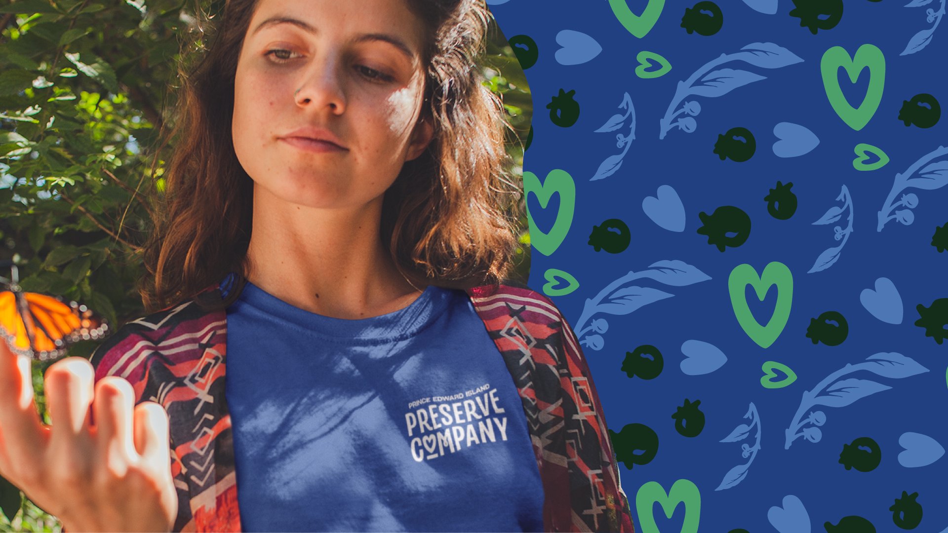
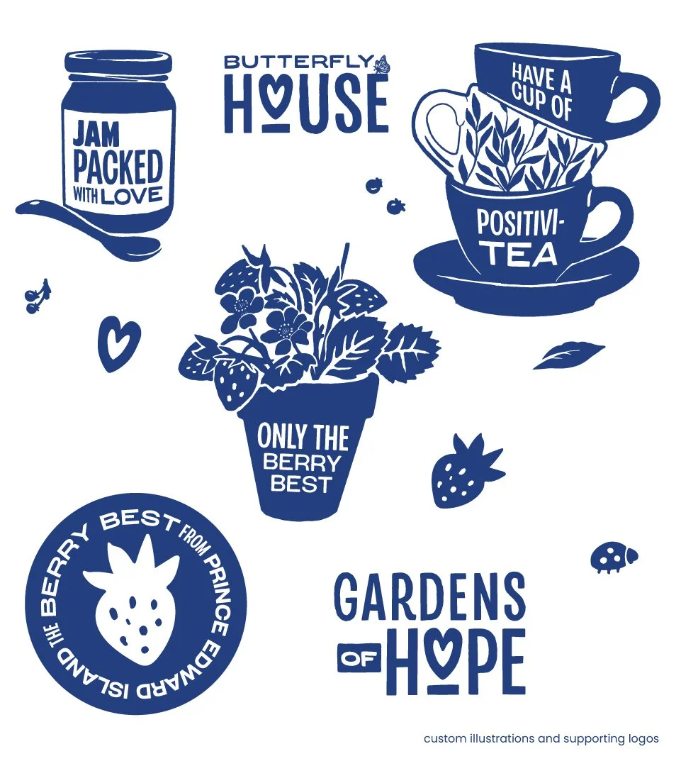
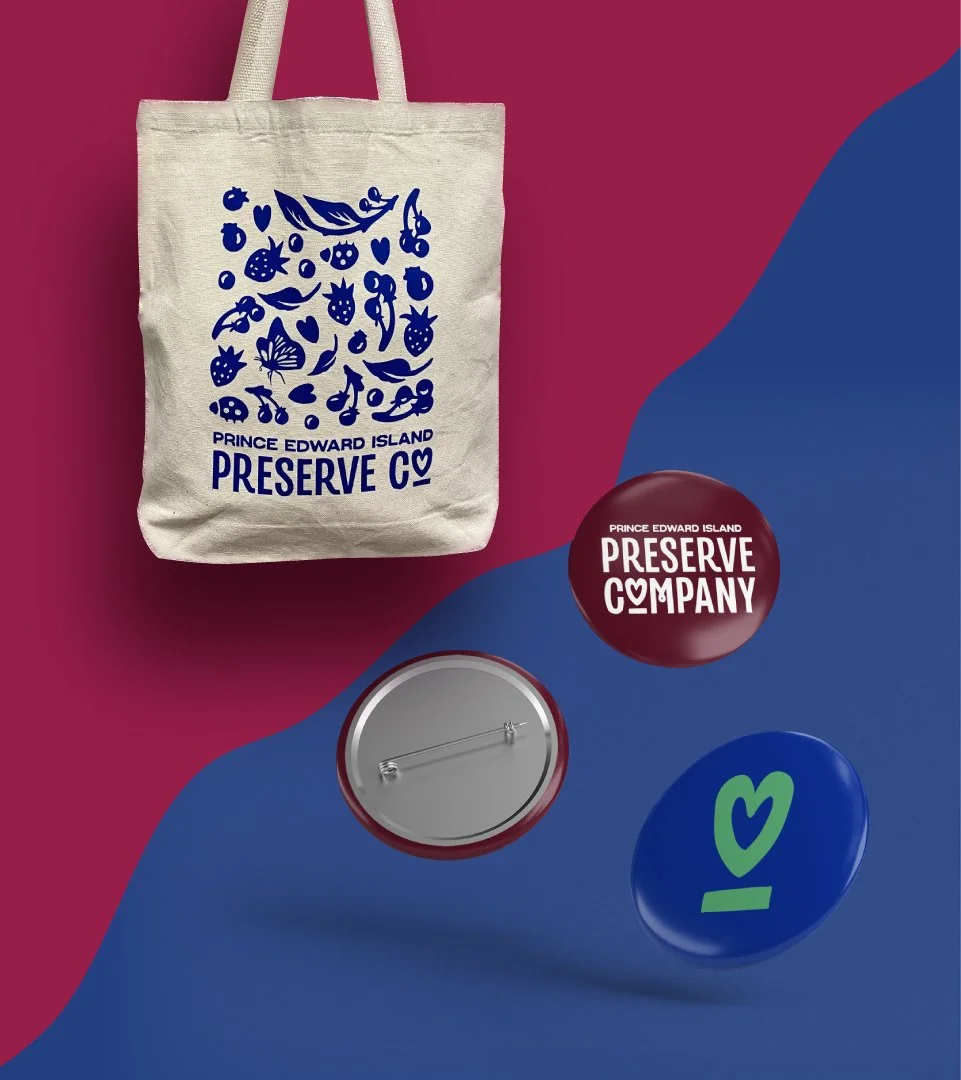
Our initial drafts of the logo direction prominently featured an update of their “P” icon, but they didn’t feel it communicated the heart they pour into their business. We took this feedback literal and took a new handcrafted direction featuring a hand drawn logo with a ❣️ replacing the “o” in Company. This new direction was a hit! And it was a thrill to see how the entire brand came together once they felt alignment with their identity.
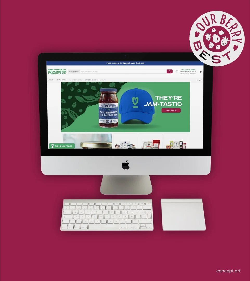
There was a collection of blue glass bottles in the restaurant at the Preserve Co, that they decided to use as a primary feature in their decor. The windows in the dining room were also beautiful blue, red, and yellow stained glass Island scenes. We pulled all these colours into the palette with minor changes to also represent the saturated tones of jellies and jams. It made for a bright and playful colour palette full of symbolism.


Agency: Hijinks Design Agency
Creative Direction and Project Management: Ashe Green RGD
Brand Strategy and Copywriting: Jaime Lee Mann
Graphic Design: Ashe Green RGD, Tim Rees, Mackenzie Craig